

How to Build a Resume That Actually Gets Read (Free CV Builder, No Signup)

Your resume's first reader probably isn't human
Most job applications today don't go to a person first. They go into an Applicant Tracking System, which extracts the text from your PDF, tries to slot it into fields (name, job titles, dates, skills), and scores it against the job posting before a recruiter ever opens it. If the parser misreads your layout, qualified candidates get filtered out silently — no rejection email, no feedback, just nothing.
This isn't a reason to panic, but it is a reason to think about your resume as two documents at once: one a human will skim for 7 seconds, and one a piece of software will parse character by character. They don't always want the same thing.
What actually confuses an ATS (the mechanical version, not the folklore)
A lot of resume advice repeats "avoid tables, avoid photos" without explaining why. Here's the actual mechanism: some ATS software extracts PDF text in raw reading order — left to right, top to bottom. A two-column layout with a photo and skills in a sidebar can get read completely out of order, so your job title ends up interleaved with a skill from the sidebar. The content isn't lost, it's just scrambled by the time a keyword matcher sees it.
Non-standard section titles cause a quieter version of the same problem. Rename "Experience" to something creative and you might be invisible to a parser tuned to look for the standard headings.
None of this means styled resumes are wrong — it means the right choice depends on who's reading first. That's the actual reason I built five templates into SolveBar's CV Builder instead of one "safe default": a plain ATS-safe layout for portal applications, and four more expressive ones for everything else.
Building the resume, without the guesswork
Open the Resume / CV Builder and you get a Basics tab, a Design tab, and a running list of sections (Experience, Education, Skills, and whatever else you add) down the left side. Every field updates a live preview on the right as you type, so you're never guessing what the PDF will actually look like.
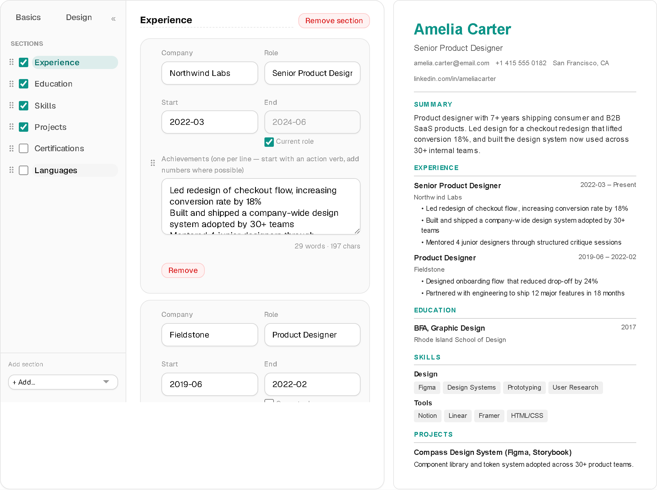
A few details that save real time once you're mid-edit:
Every section supports drag-and-drop reordering — both the sections themselves and individual entries within a section (put your most recent or most relevant job first without retyping anything).
Word/character counters sit under the summary and bullet fields, so "how long should this be" becomes a visible number instead of a guess.
Undo is a toast, not a confirmation dialog — delete an entry by mistake and a one-click Undo appears at the bottom of the screen for a few seconds, instead of a scary "are you sure?" popup interrupting your flow.
Everything autosaves to your browser's local storage. Close the tab, come back next week, your draft is exactly where you left it — no account required.
Checking your resume before you hit apply
This is the part most resume builders skip entirely. Click the score pill in the top bar and it opens a breakdown of what's actually weak — missing contact fields, a summary that's too short or too long, experience bullets with no numbers or action verbs, too few (or too many) listed skills. Click ATS next to it, and you get two more things: format-risk warnings specific to your chosen template (photo in a risky sidebar, an unusual font), and a keyword-match checker — paste in an actual job description and it scores your resume against that specific posting, then lists the meaningful terms you're missing.
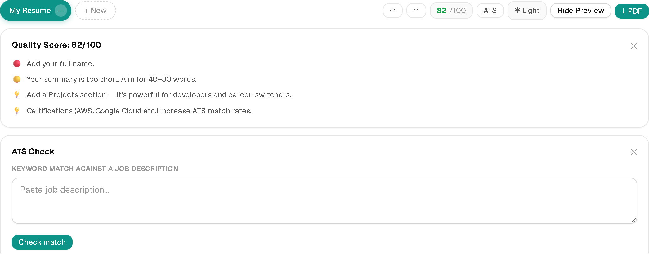
That last part matters more than generic advice does. "Use keywords" is useless without knowing which keywords a specific job actually cares about — this tells you.
Which template should you actually use?
Classic and Minimal are safe, single-column defaults that read well either way. ATS-safe strips out anything that could confuse a parser — use it for large-company application portals where you genuinely don't know what's on the other end. Modern (dark sidebar) and Creative (accent header, optional photo) look the strongest to a human reading directly, which is the right tradeoff when a person opens your PDF first — a referral, a small company, a direct email to a hiring manager.
There's no template that's objectively correct for every application. There's only the honest tradeoff: what looks best to a person skimming for seven seconds is often structurally riskier for the software that reads it first. Pick per application, not once and forever.


